Liberty Church Brand Identity
Liberty Baptist Church needed two logos—one for the main church and one for the kids ministry. I started with the main church logo, focusing on creating a design that conveyed trust and inclusivity. Once that foundation was established, I used it as the basis for the kids ministry logo, carrying over the colors, font, and imagery while giving it a younger, more whimsical feel. Additionally, I created business cards, a reusable letterhead template, and promotional items.
Certain details have been modified to protect the client’s privacy.

Brand guidelines
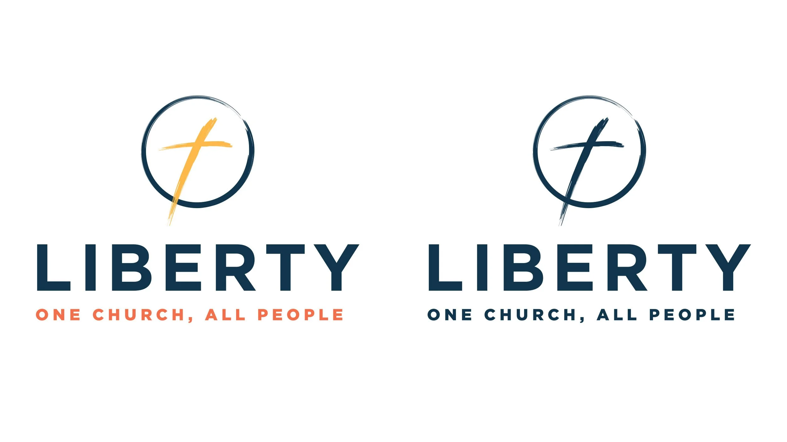
For the main logo, I chose colors that convey trust (navy blue), warmth (orange), and happiness (yellow), paired with a clean sans serif font in two weights for balance and professionalism. The icon features a brush-stroke cross enclosed by a circle—symbolizing unity in Christ and reflecting the church’s tagline, “One Church, All People.” I created adaptable versions suited for both portrait and landscape use, as well as black, white, one-color, and full-color applications.
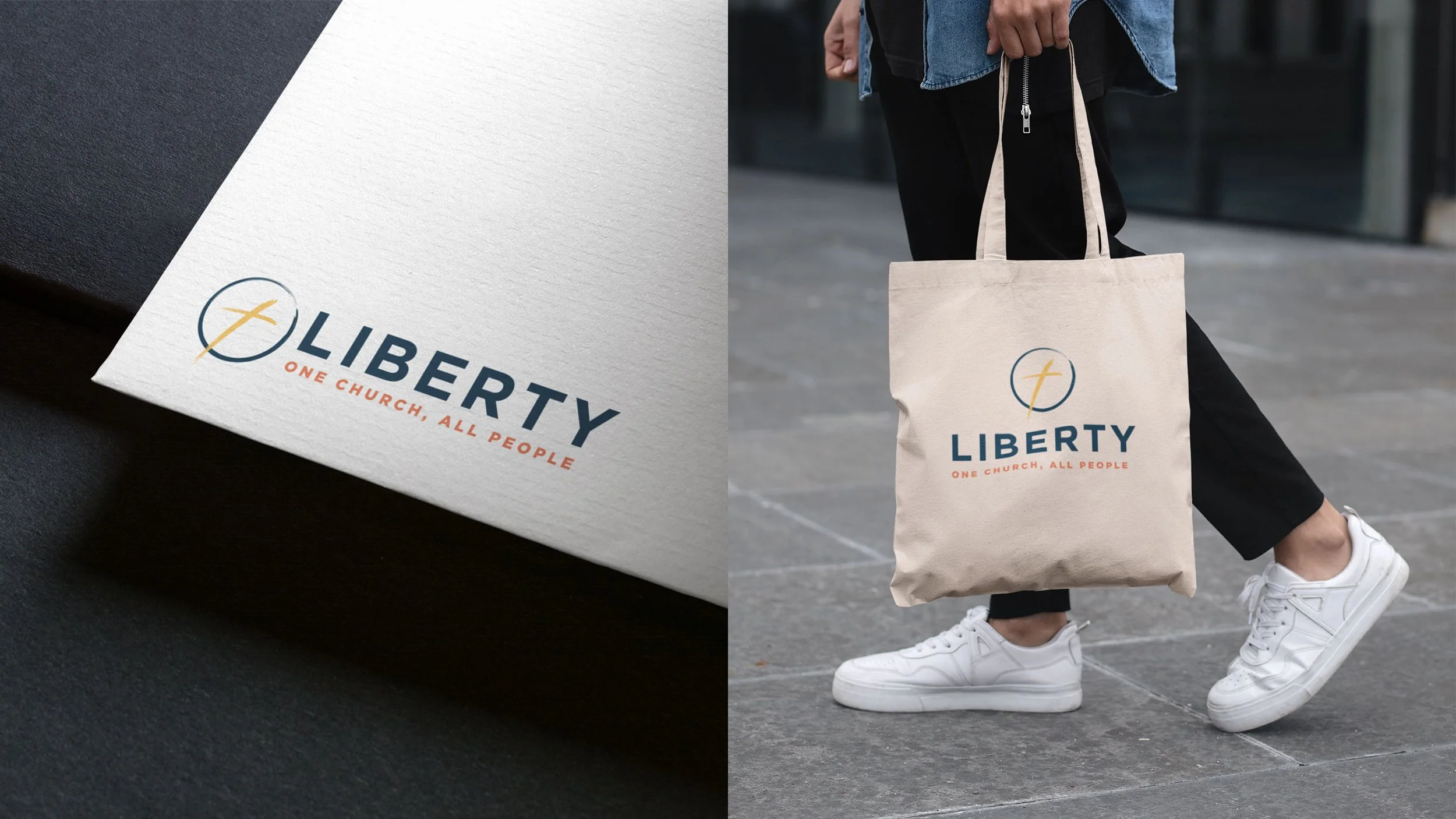
Full-color branded envelope and tote bag
Portrait logo in full-color and one-color

Full-color letterhead and branded cup

Portrait logos in black and white

Full-color business card

Landscape logos in full-color, one-color, white, and black

Black and white logo promotional items
Kids Ministry Logo
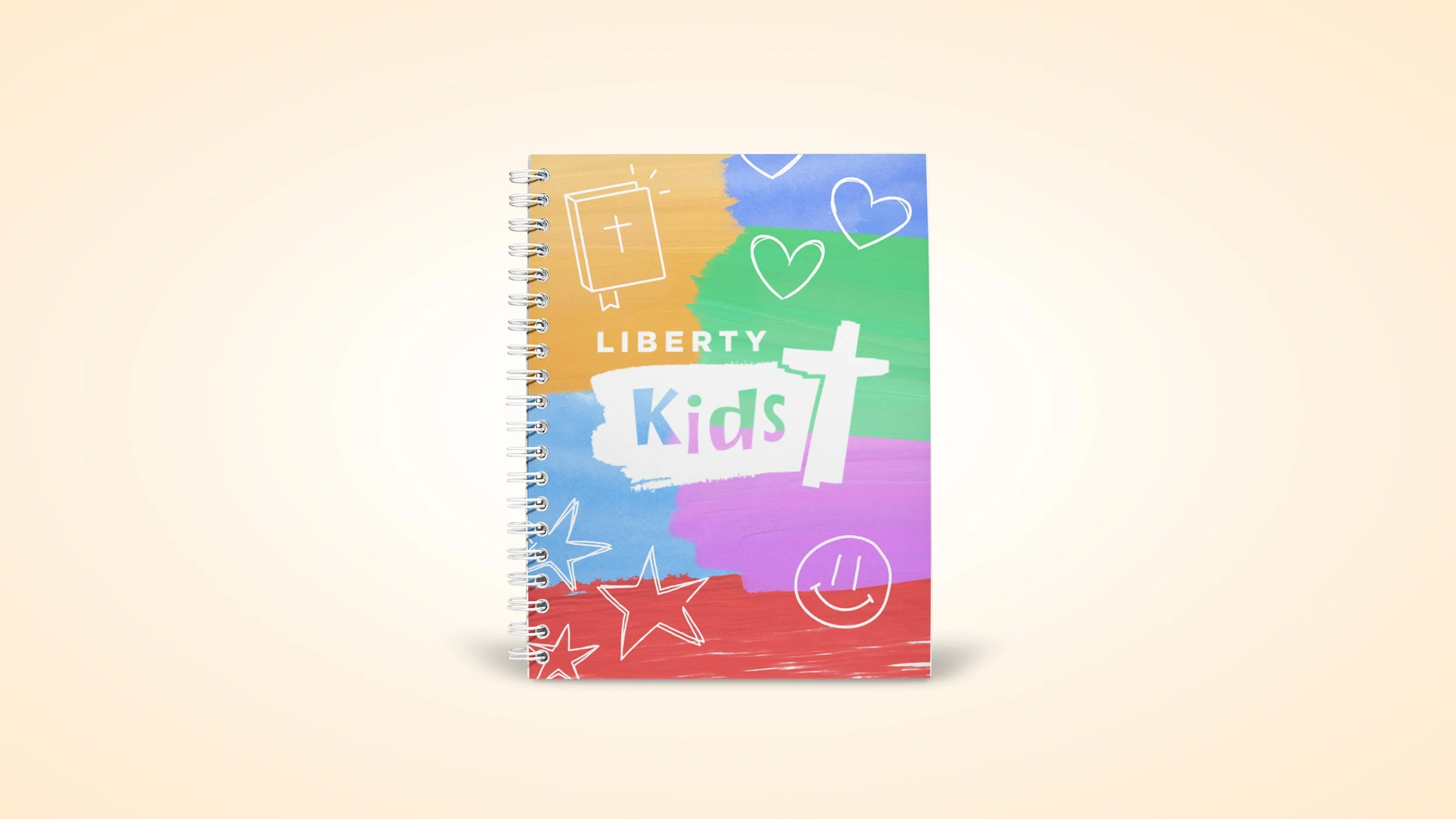
Referencing the main church logo, I kept the same colors and Gotham font for “Liberty.” I added a playful font for “Kids,” redesigned the cross, and carried the brush-stroke theme into the painted background to tie the designs together.
A few iterations before arriving at the final design

Liberty Kids T-shirt and social media post

Full-color, one-color, black, and white logos
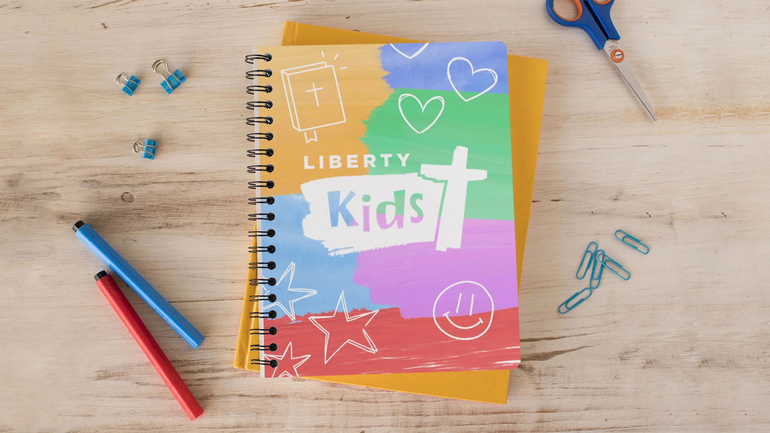
Notebook design; white logo