
University of Phoenix UX/UI
As a UX Design Lead at the University of Phoenix, I was responsible for designing and iterating on several responsive components and features for the new online student financial aid experience—an initiative aimed at simplifying what is often a complex process for students.
During my time with the company, I designed flows for:
Dynamic student dashboard
Document uploader and tracker
Automated chatbot interactions
Tooltips and loading components
Interview outreach automation
Login experience
Error scenarios
User surveys
My process combined customer interview insights and collaboration with the engineering team to prioritize upcoming features. Our roadmap was managed in Jira, where I completed design tickets based on priority and release goals.
The project below offers an in-depth look at my design process for the document uploader and tracker feature within the online financial aid experience.
Document Uploader & Status Tracker
To kick off the project, I reviewed the journey map, noted my questions and initial ideas, and then created a quick sketch on my iPad before moving into Figma to begin the design.
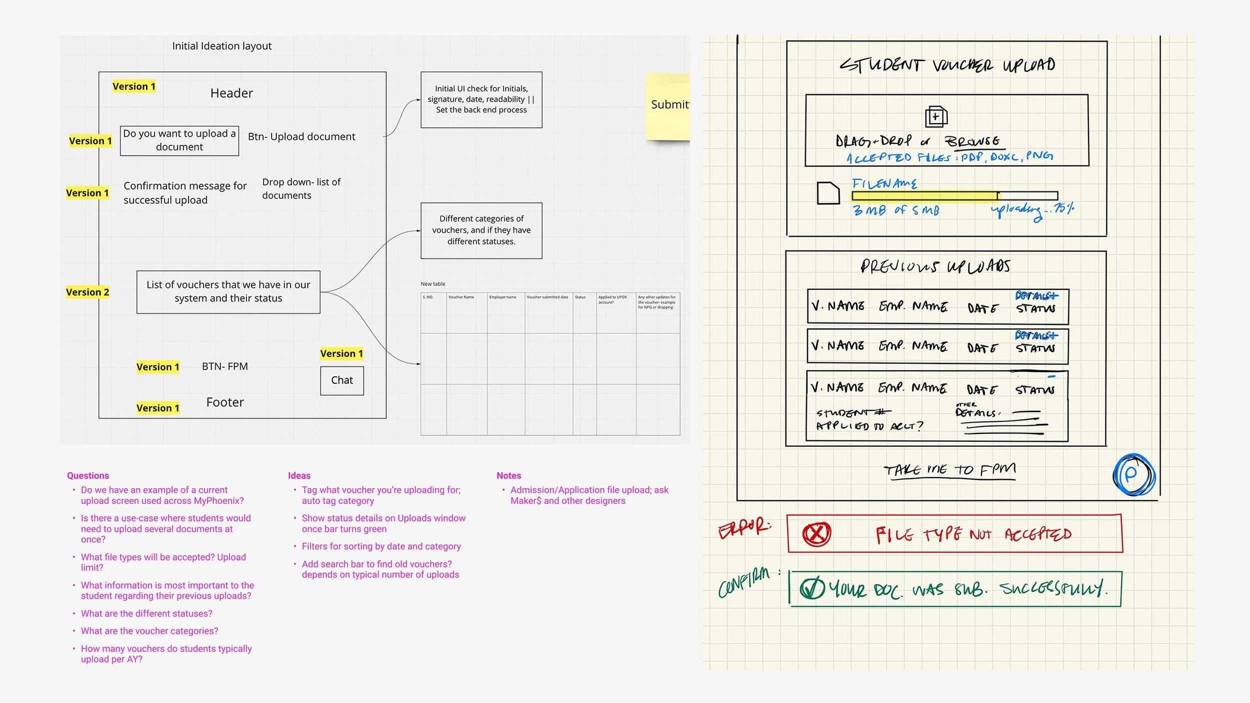
Miro board journey map; questions and ideas; rough sketch
I began by drafting the document uploader experience first, taking into consideration any errors that a user may potentially experience.
Step 1: Upload file; file type error

Step 2: Upload progress; interruption error
Step 3: Upload progress complete
Step 4: Submission successful
Once the first draft was complete, I would either present it live or, more often, record a walk-through video for the product trio team. This streamlined collaboration and reduced unnecessary meetings by allowing everyone to review the designs on their own time and come prepared with thoughtful feedback for the next check-in.
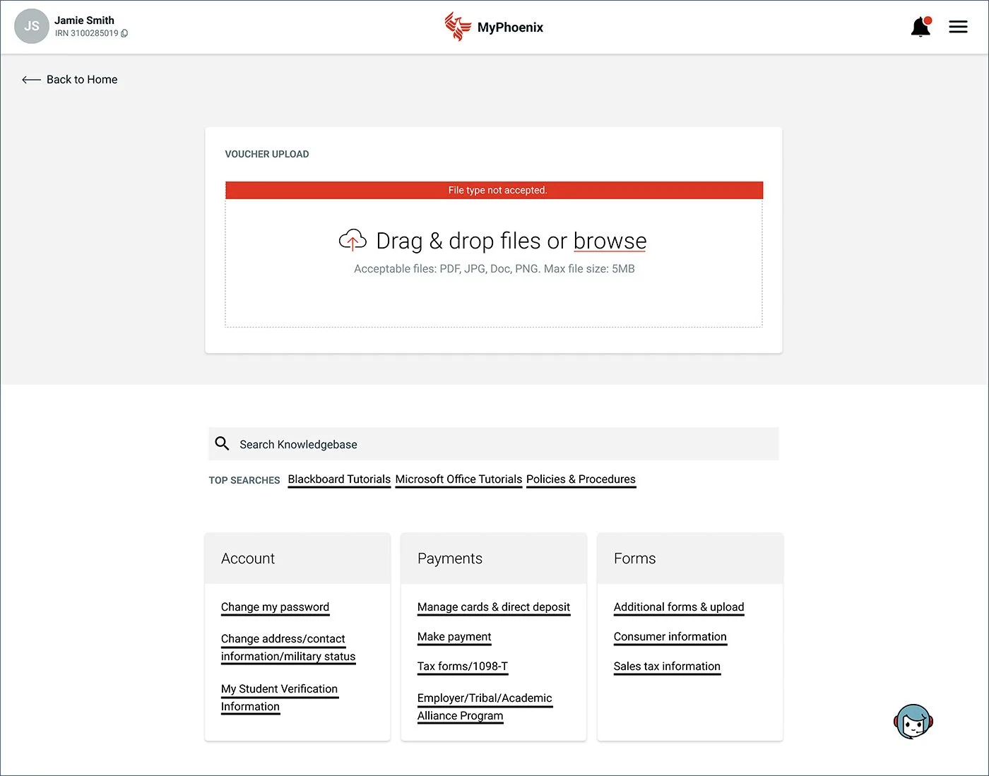
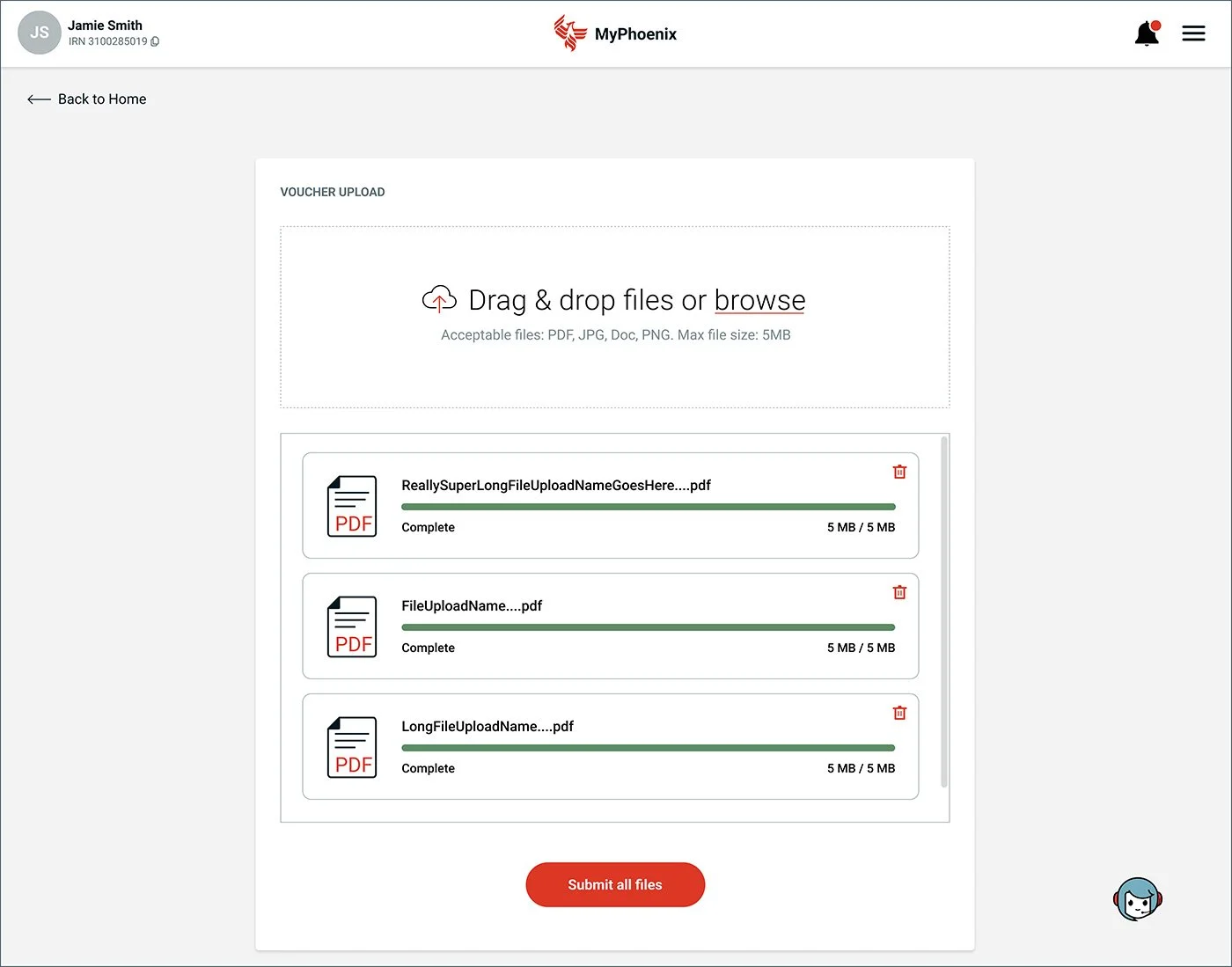
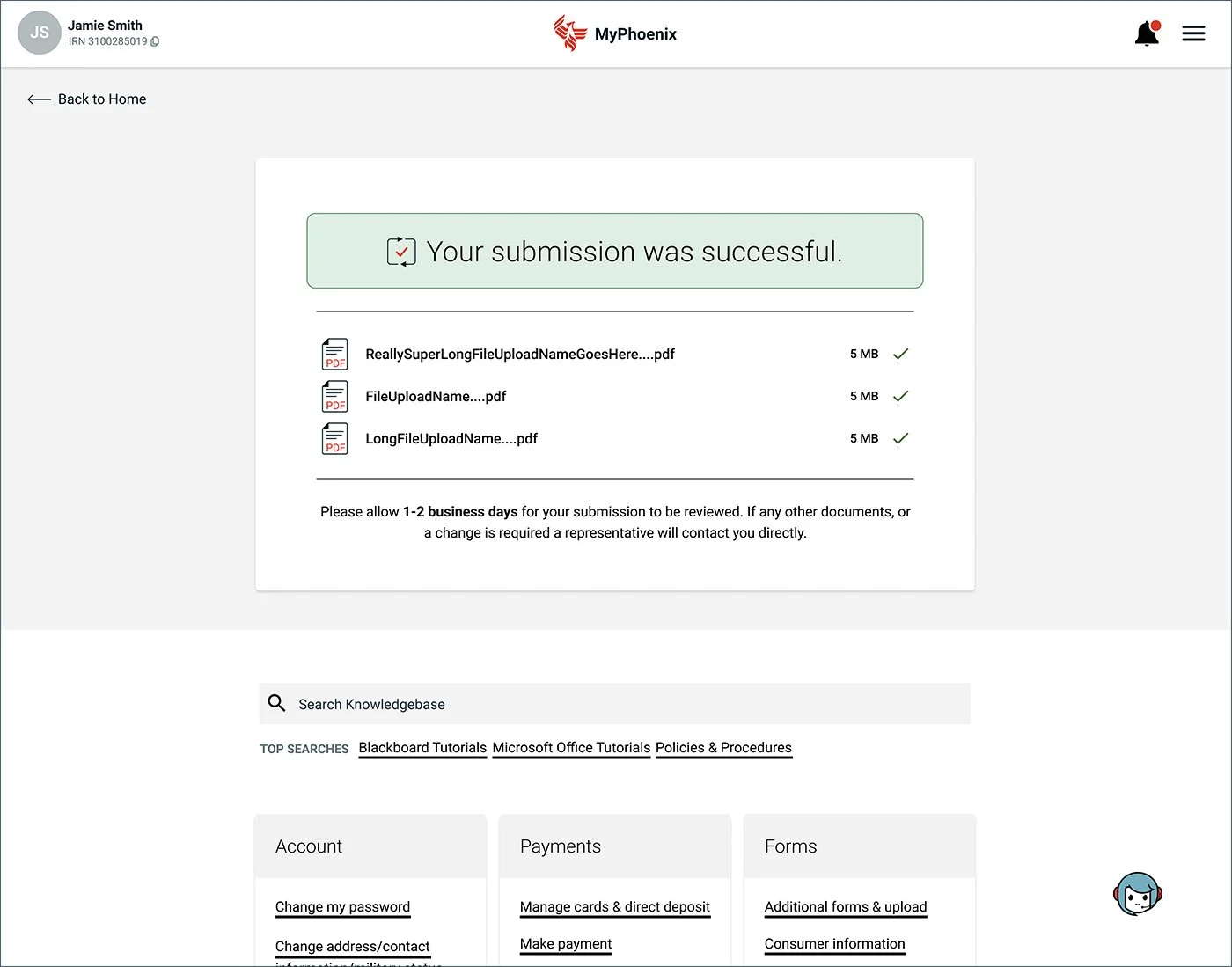
After meeting with the product team, I discovered a few additional error scenarios were needed. Along with the file type error in step 1, I added a file size error, introduced single and multiple file errors in step 4, added an ‘Upload More Files’ button in step 4, and simplified some of the wording.

Step 1: Landing page; file upload
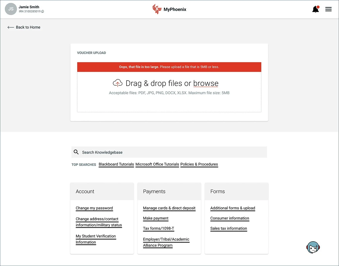
Step 1: File size error

Step 1: File type error
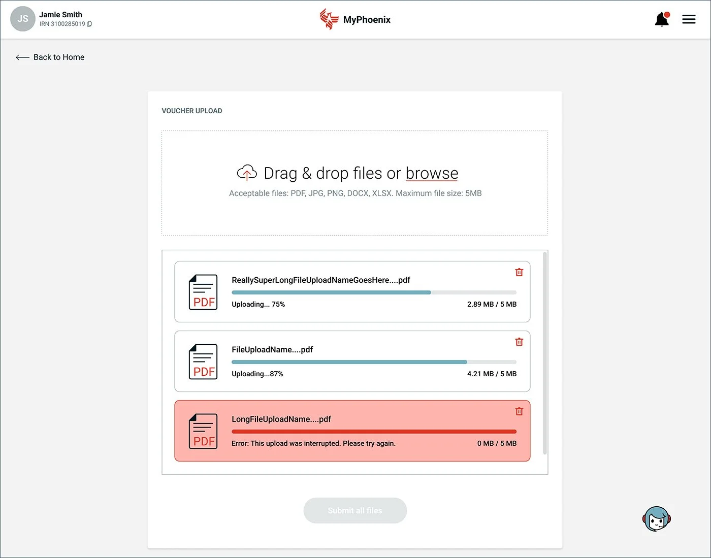
Step 2: Upload progress; interruption error

Step 3: Progress complete
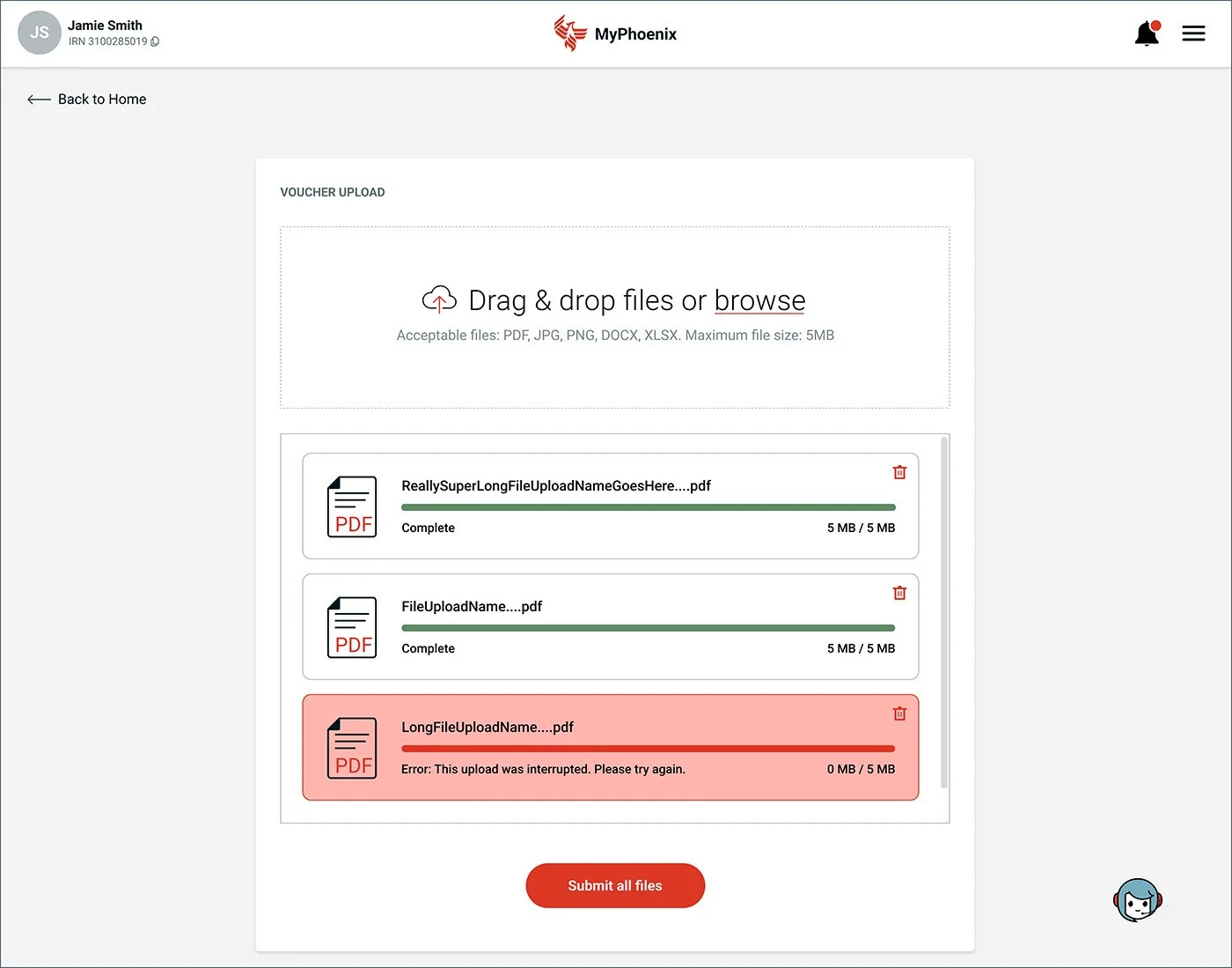
Step 3: Progress complete; interruption error
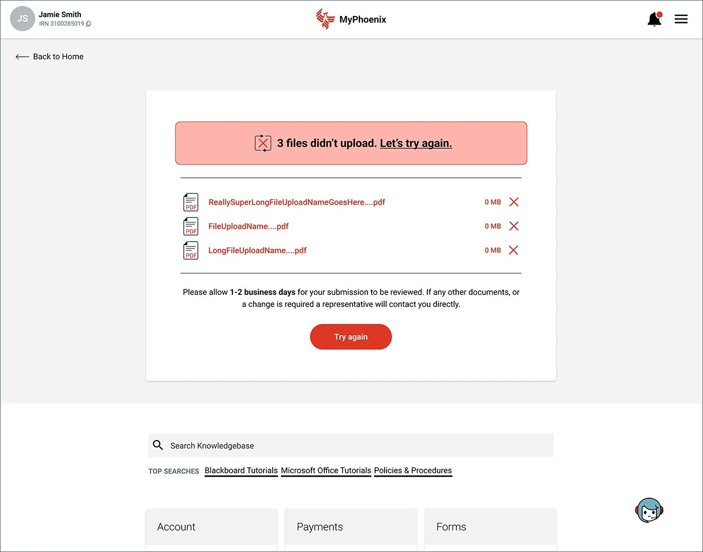
Step 4: Multiple upload error

Step 4: Single upload error

Step 4: Successful upload
We also wanted to provide users with a way to share feedback on this new upload process so that we could continuously improve the experience. I designed the feedback flow seen below.

"Share Feedback" button added to the righthand side of the page

Step 1: Feedback modal

Step 2: User selected "Good"
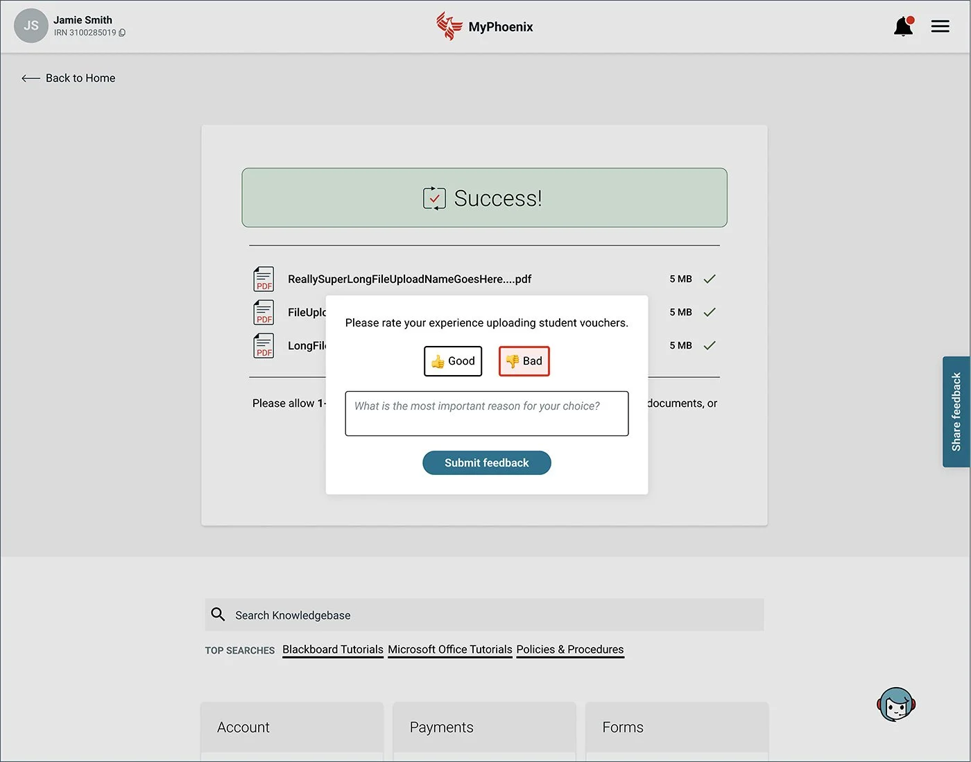
Step 2: User selected "Bad"
With the core user flow and desktop layout established, I then adapted all scenarios for mobile.

Landing Page

File type error

File size error

Upload progress

Upload complete

Interruption error

Single upload error

Multiple upload error

Successful upload
I followed the same process for phase two—the status tracker feature shown below, which allows students to monitor their uploaded documents to see whether further action is needed, if a review is pending, or if approval has been granted. It also displays the document number and submission date.

Closed Accordion

Action Required
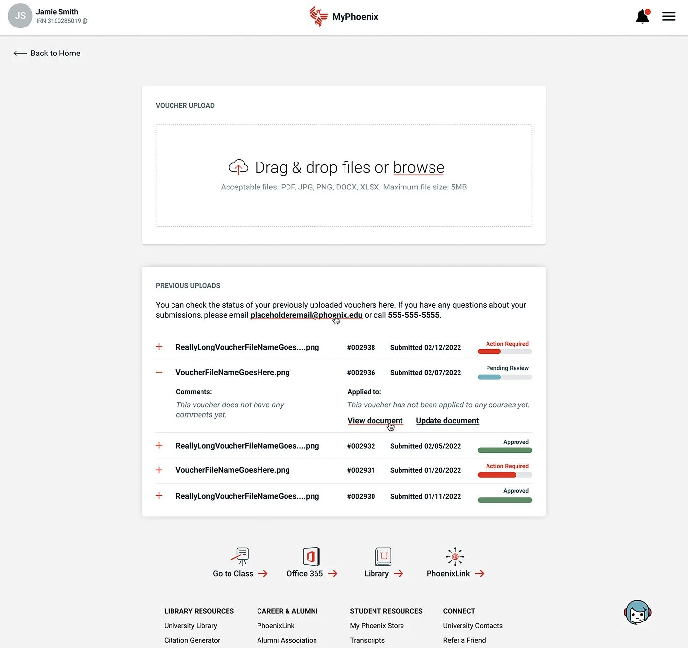
Pending Review

Approved
Once all the designs were finalized and approved, I organized the Figma file and shared it with the development team for implementation.

Final dev file